
Projects
My Voyage Care Solutions
One site serving two audiences at once: families choosing care, and referrers placing under time pressure.
- Client
- My Voyage Care Solutions
- Field
- Health & social care
- Services
- Art direction, UX/UI Design, Web development, Branding
- Year
- 2026
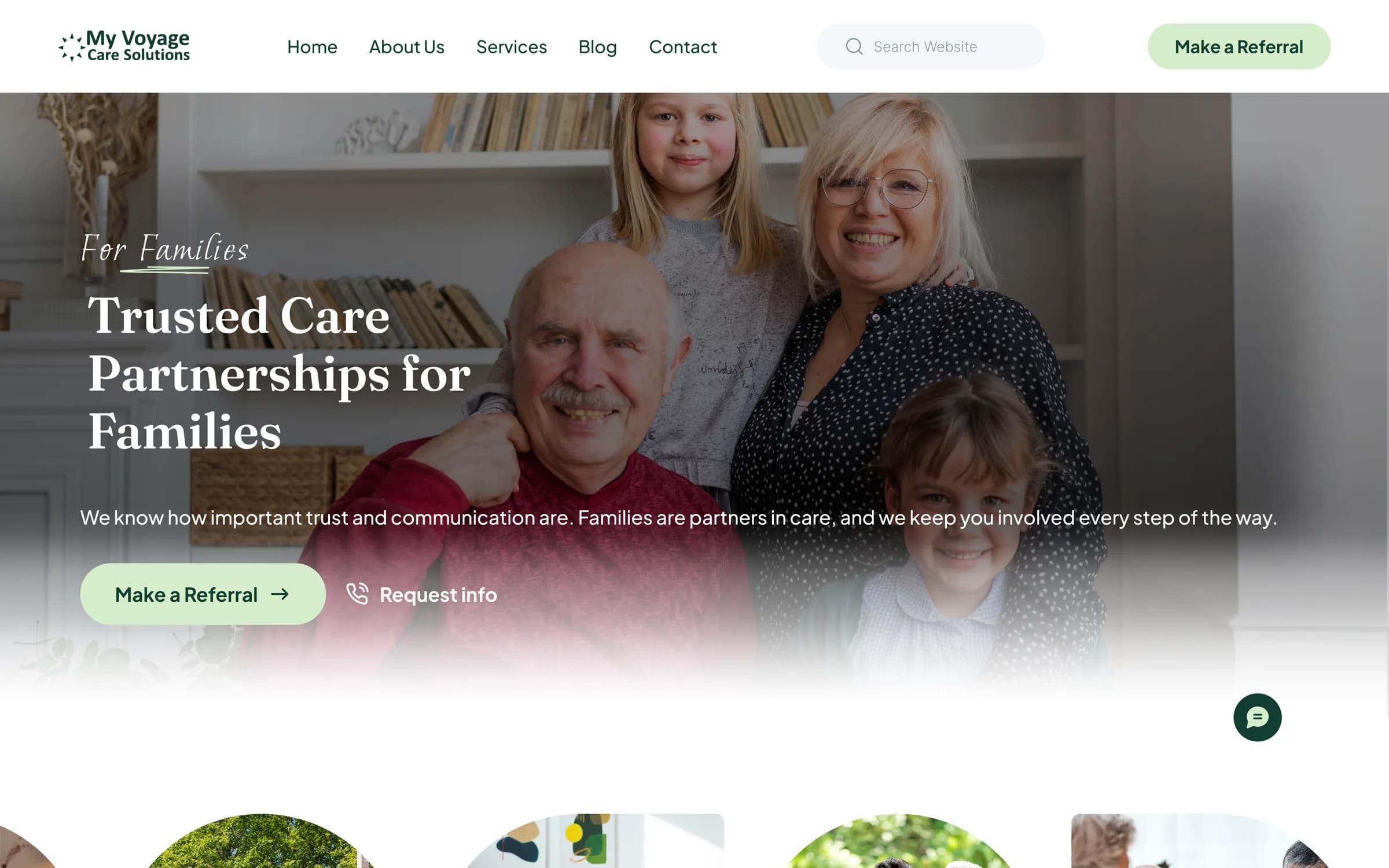
The brief
My Voyage Care Solutions is a UK-based provider offering supported living, live-in care and mental health support. Their website has to work for two audiences with almost nothing in common: families choosing care for someone they love, and referral partners — social workers, commissioners, placement teams — who arrive under time pressure and need to know whether a placement is viable.
Those readers want opposite things. A family needs reassurance, plain language and a sense of who they would be trusting. A referrer needs process, timescales and compliance, and finds warmth actively unhelpful when they are trying to establish whether a bed is available tonight. Serving one well usually means failing the other.
Our approach
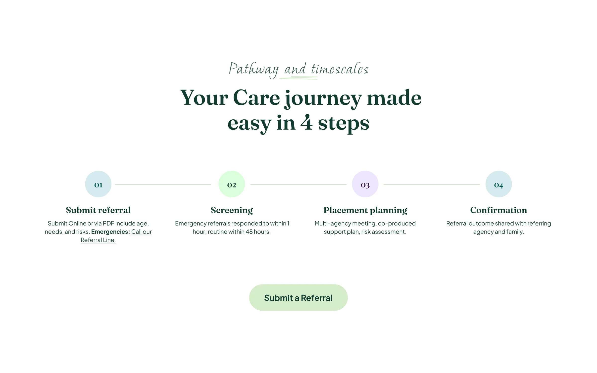
We split the journeys rather than averaging them. Family-facing pages lead with people and photography and keep the language ordinary. Referrer-facing pages lead with process: what to submit, how quickly it is screened, what happens at each stage, and how to reach someone in an emergency.
That decision is why the referral pathway is laid out as four numbered steps with response times attached. A referrer should be able to answer “can these people help me today?” without making a call, and a stated timescale does more for credibility than any amount of description.
Visually the site had to feel human without feeling casual, since the subject is people's care. Serif headings and a soft green palette carry the warmth; the layouts underneath stay plain and legible, because a lot of the reading happens quickly and on a phone.
What we built
A site that lets both audiences self-select within a few seconds of landing, and keeps the referral route within reach from anywhere on it.
- Referral pathway with published screening and response timescales
- Emergency referral route surfaced separately from the routine one
- Services architecture covering supported living, live-in care and mental health support
- Family-facing content built around photography and plain language
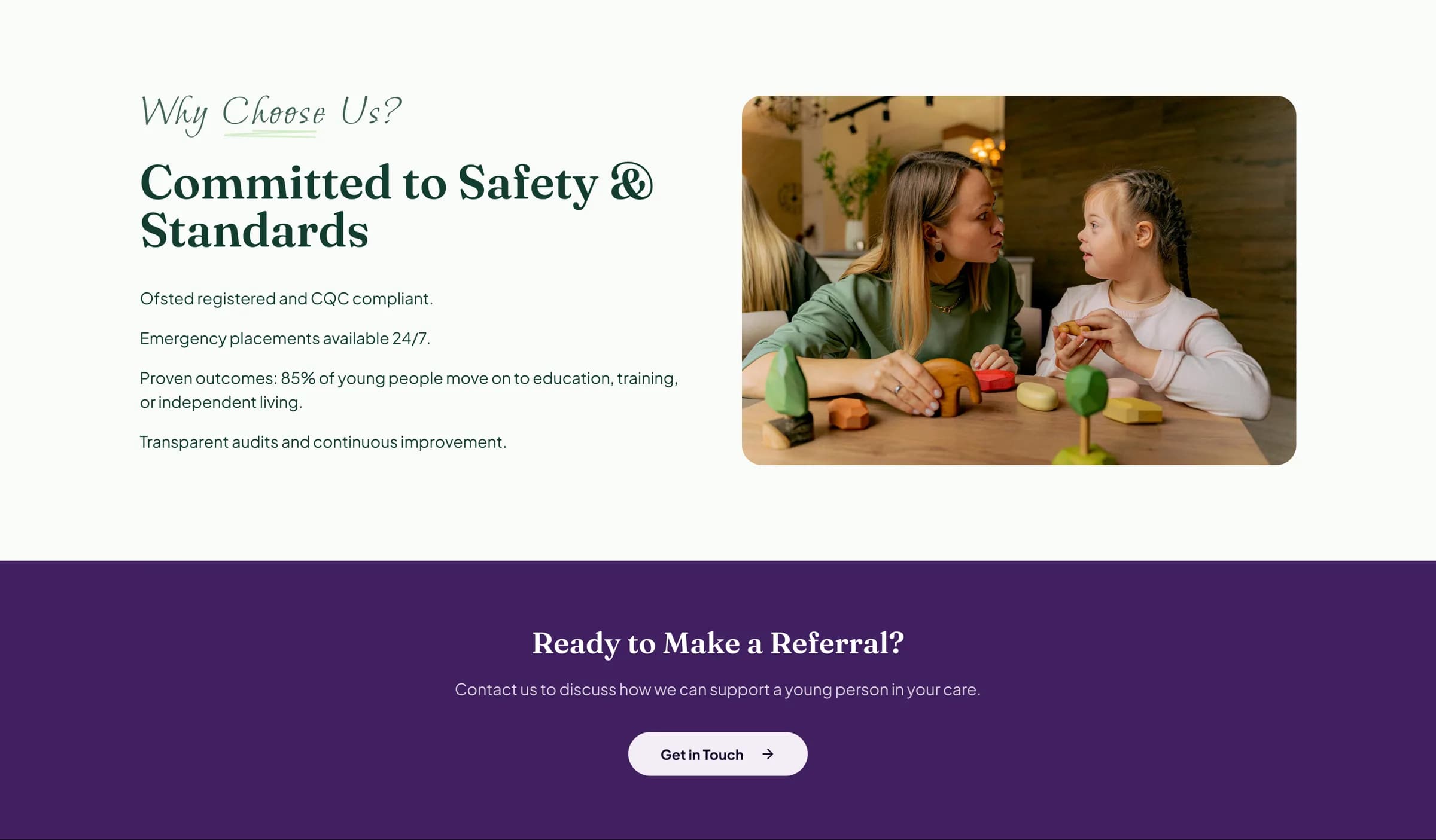
- Safety and standards section carrying regulatory credentials
- Blog and site-wide search
- Accessible, responsive layouts, with mobile as the primary context
Results
Families and referral partners can now both find what they came for without wading through material written for the other. Feedback was handled patiently on both sides, and decisions were explained in plain terms rather than defended in design language — which matters when the client is the expert on their own service and we are not.
Testimonial
“Trust is key for care providers, starting with our online presence. LofiCode grasped our services, from supported living to live-in care, creating a clear, reassuring site for families and partners. They patiently handled feedback and explained decisions simply. The new website reflects our care quality and helps people quickly understand our work.”